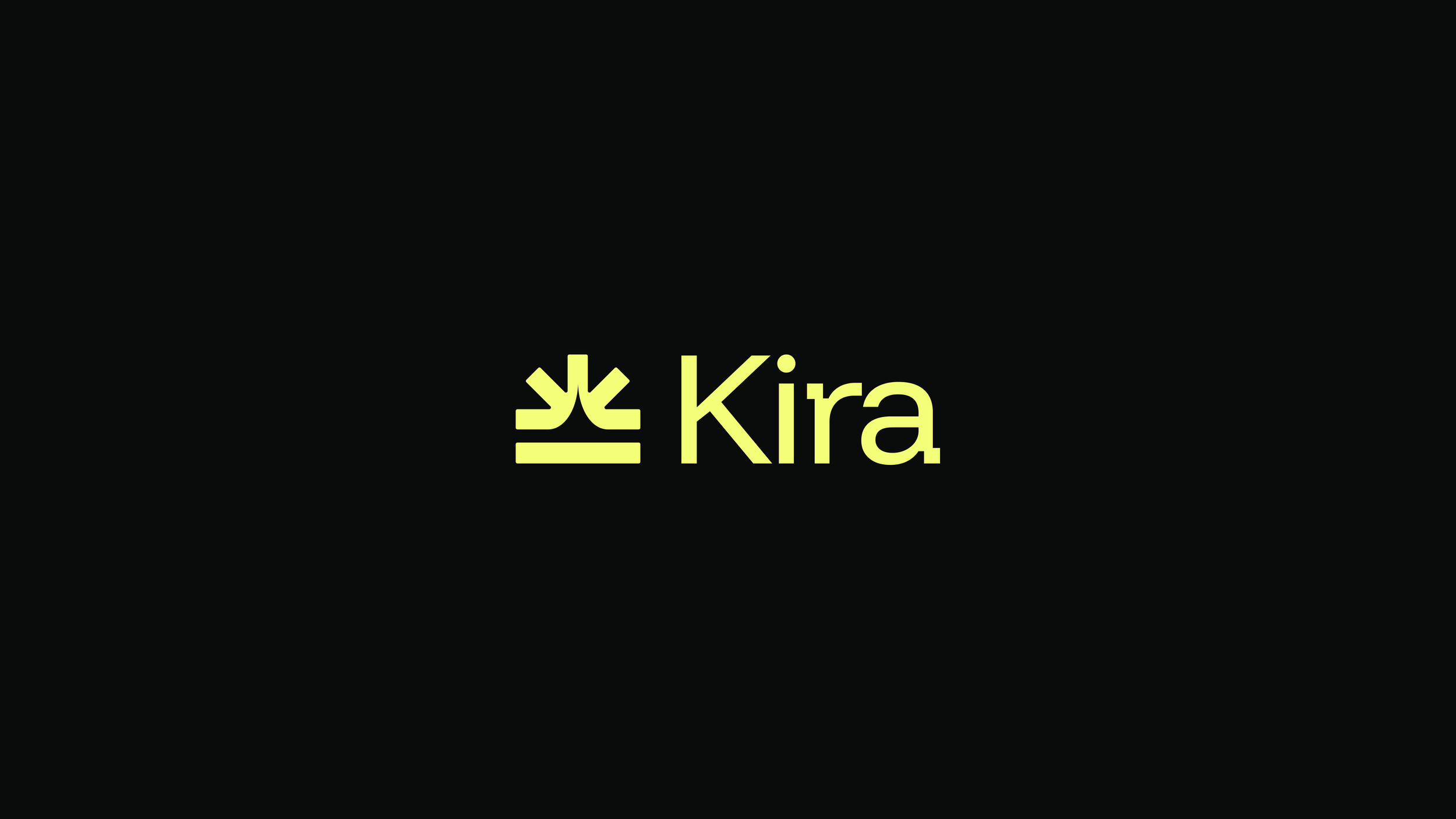
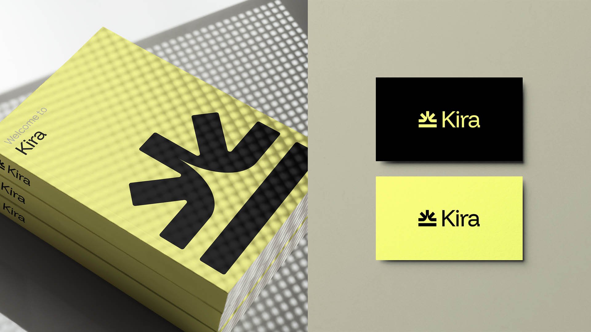
Kira AI
I led the strategy and brand identity design for Attain Healthtech, developing a new company logo that reflects their future-facing vision. This work included close collaboration with the executive team and CEO to align on positioning, secure buy-in, and set a clear creative foundation ahead of their AI product launch.
Brand strategy
Brand identity
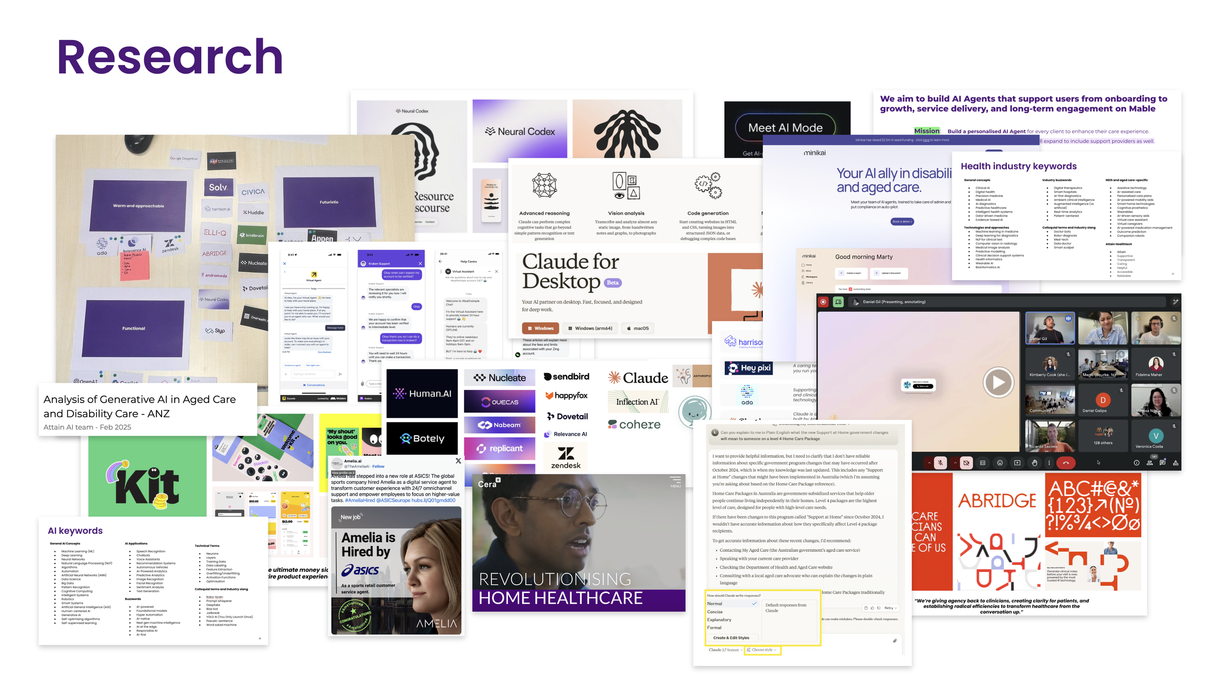
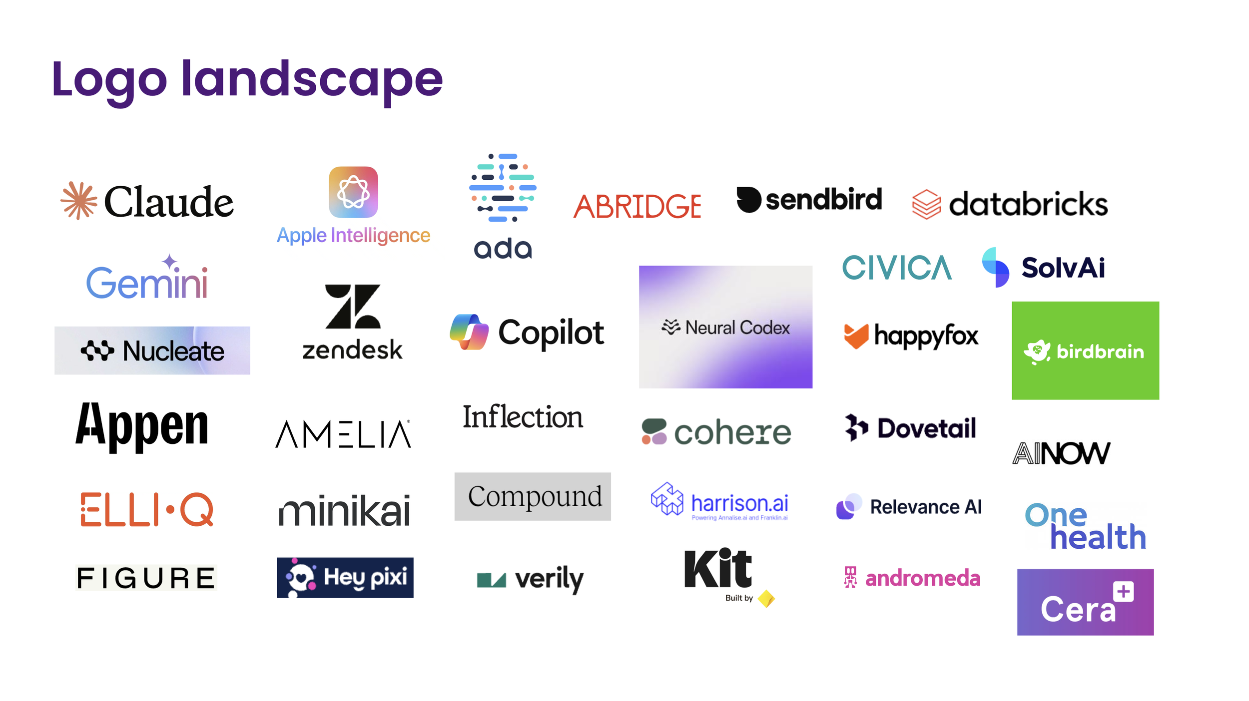
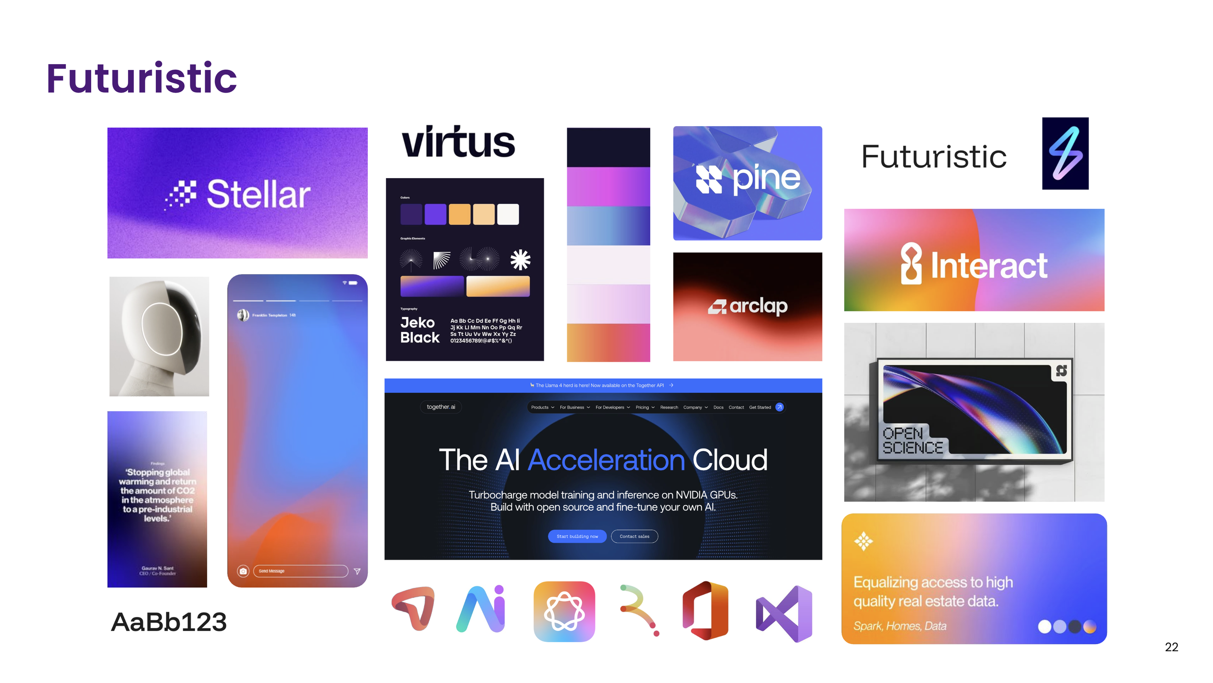
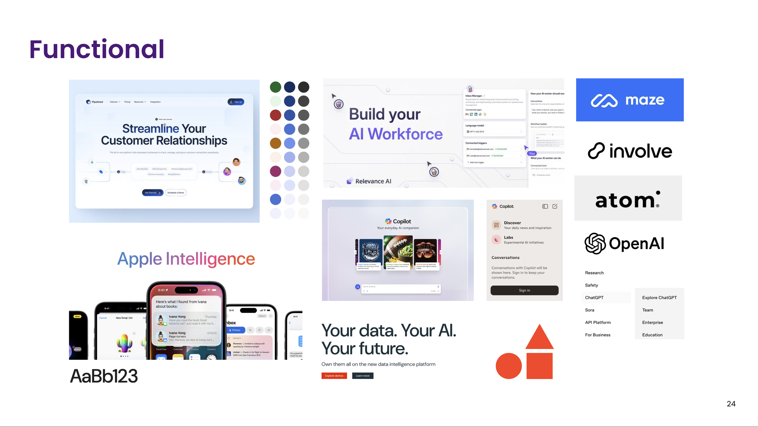
Pattern across big tech: functional product names, paired with gradient or abstract marks that signal innovation without losing clarity.
01 - Research
Three names, four territories, one shared vocabulary.
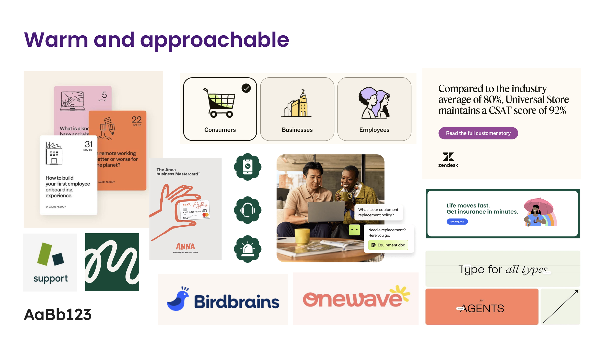
The brief split into three naming jobs — company, product, and avatar — modelled on how Apple separates Apple, Apple Intelligence, and Siri. Before naming anything, we mapped 30+ AI competitor logos and four detailed case studies, then sorted the whole category into four territories so "what sounds good" became a shared vocabulary instead of a matter of taste.
Warm & approachable
friendly, guide, together, community, care
Futuristic
visionary, next-gen, intelligent, cutting edge
Functional
streamlined, accessible, easy to use, adaptive
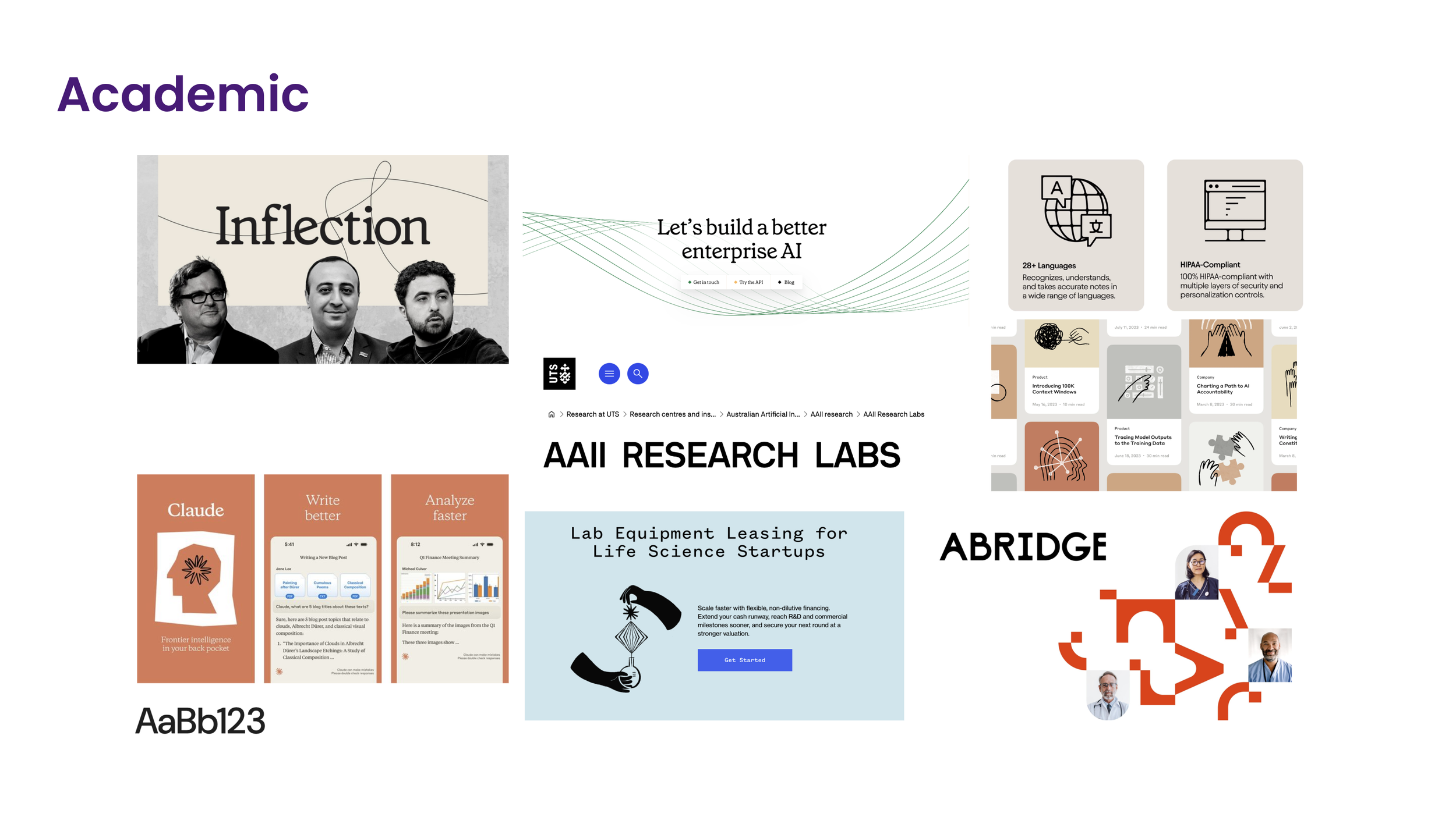
Academic
research, evidence-based, rigorous, insight
Four names, two visual directions, tested side by side.
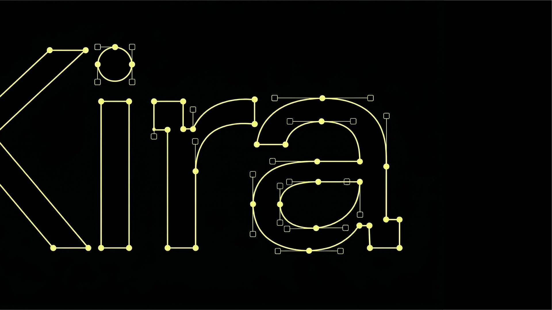
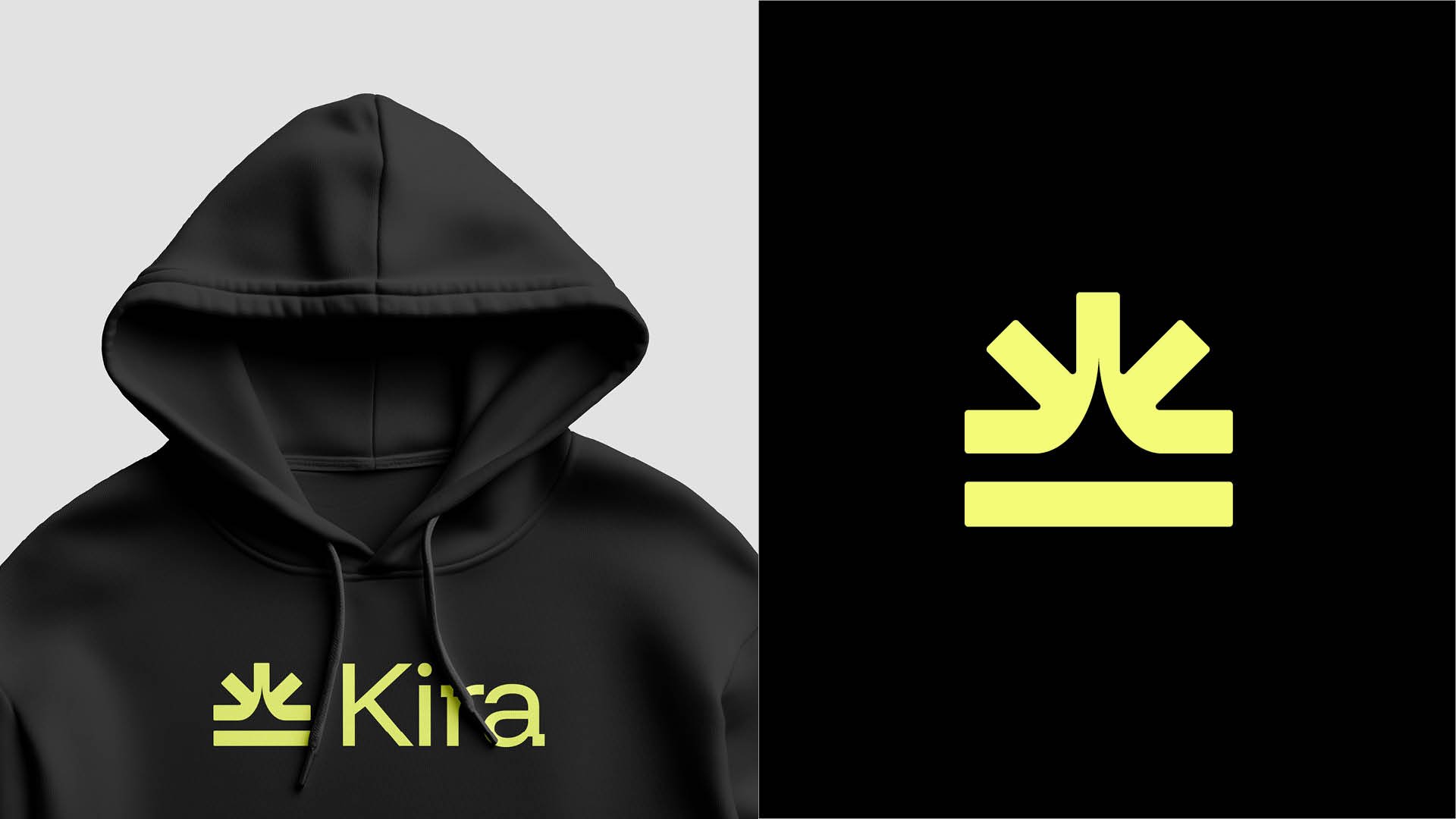
Two visual directions carried the shortlist: a soft, rounded "orb" mark (Orba, Alba) and a sharp, futuristic mark (Kira, Romara).
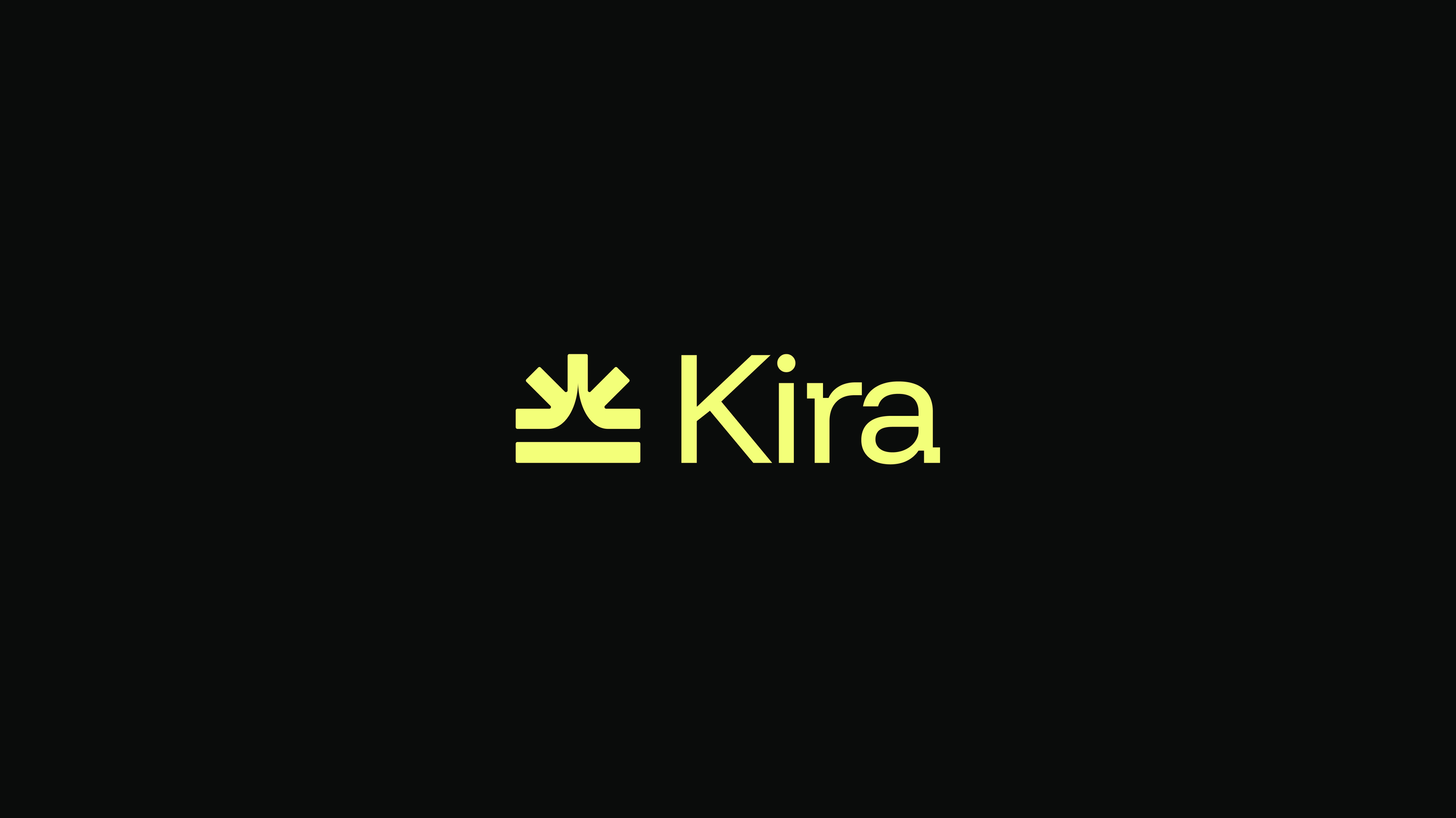
Kira carries meanings of "ruler" and "strength" in Slavic roots, and "shine" or "sparkle" in Japanese — a name built to feel confident and quietly powerful rather than cold or abstract.
Cleared feasibility cleanly: short, phonetic, easy to say and spell, with no conflicting businesses in the same category.