Mable’s people brand
A ground-up refresh of Mable's internal People brand. Employee research, a values system, a visual identity, and the assets that carried it into onboarding, social, and the careers site.
Art direction
Display ads
OOH
Print assets
Social
The brief started as an email: two rounds sent to the whole company, asking people to help write the values themselves.
Insight is where we start with all our strategy.
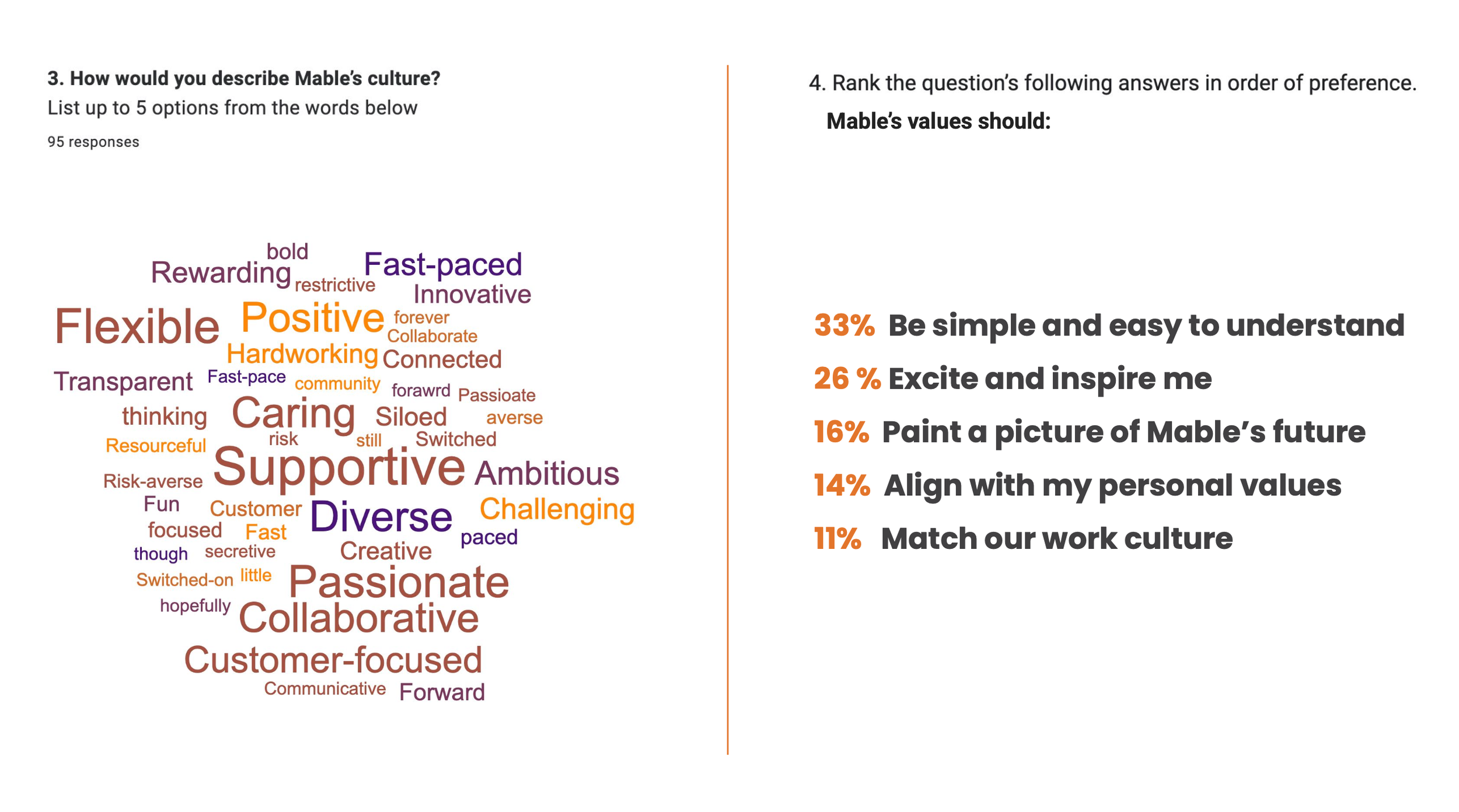
The open-text answers did two jobs at once. The word cloud gave us the vocabulary people already use: supportive, collaborative, passionate, customer-focused. The refresh could sharpen an existing culture instead of inventing one.
The ranked chart set the brief for everything after it: simple first, inspiring second.
100
survey responses across two email waves, from a company of 263
+70%
said "I want to make a difference" was their biggest motivator at work
33%
wanted new values to be simple and easy to understand above all else
Four directions, tested against what people told us.
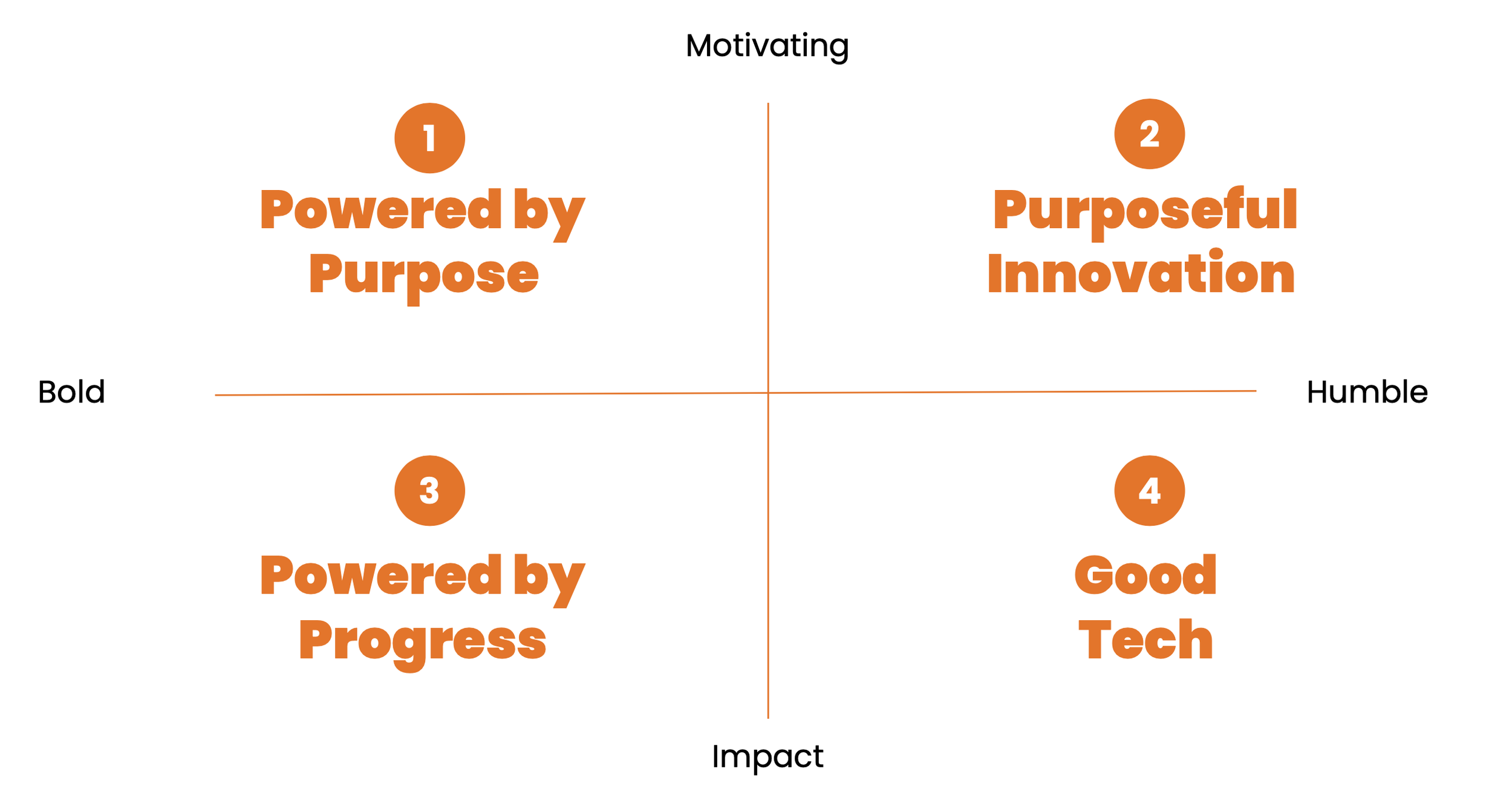
"Powered by Purpose" won: bold, motivating, and a direct line back to the +70% survey insight.
We looked at how other tech companies split their consumer and people-facing lines: Atlassian's "impossible alone, possible together," Canva's "what will you design today?" Then we mapped four candidate directions for Mable against two tensions: bold vs. humble in tone, and motivation vs. impact in message.
Built as a kit, not a one-off poster.
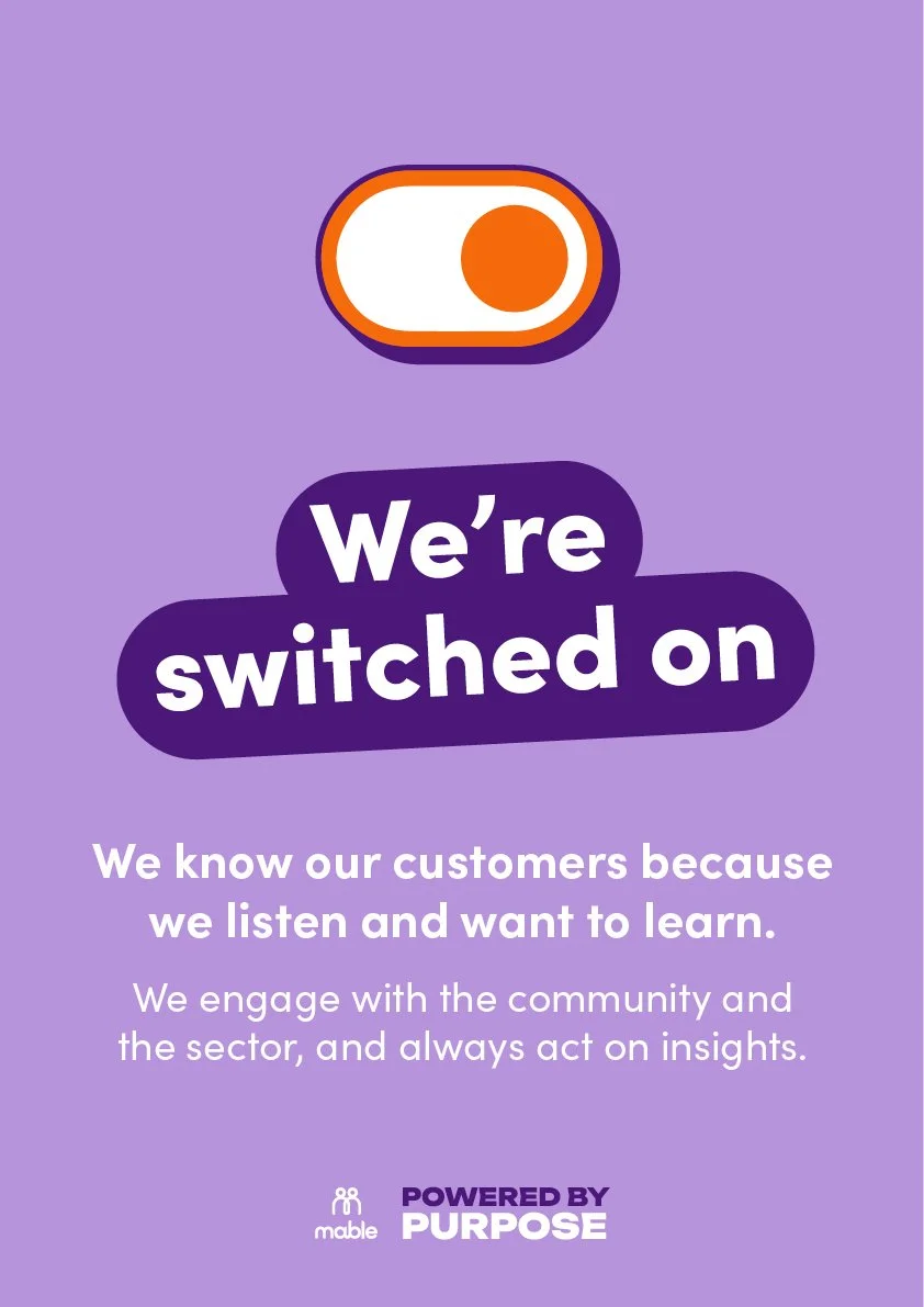
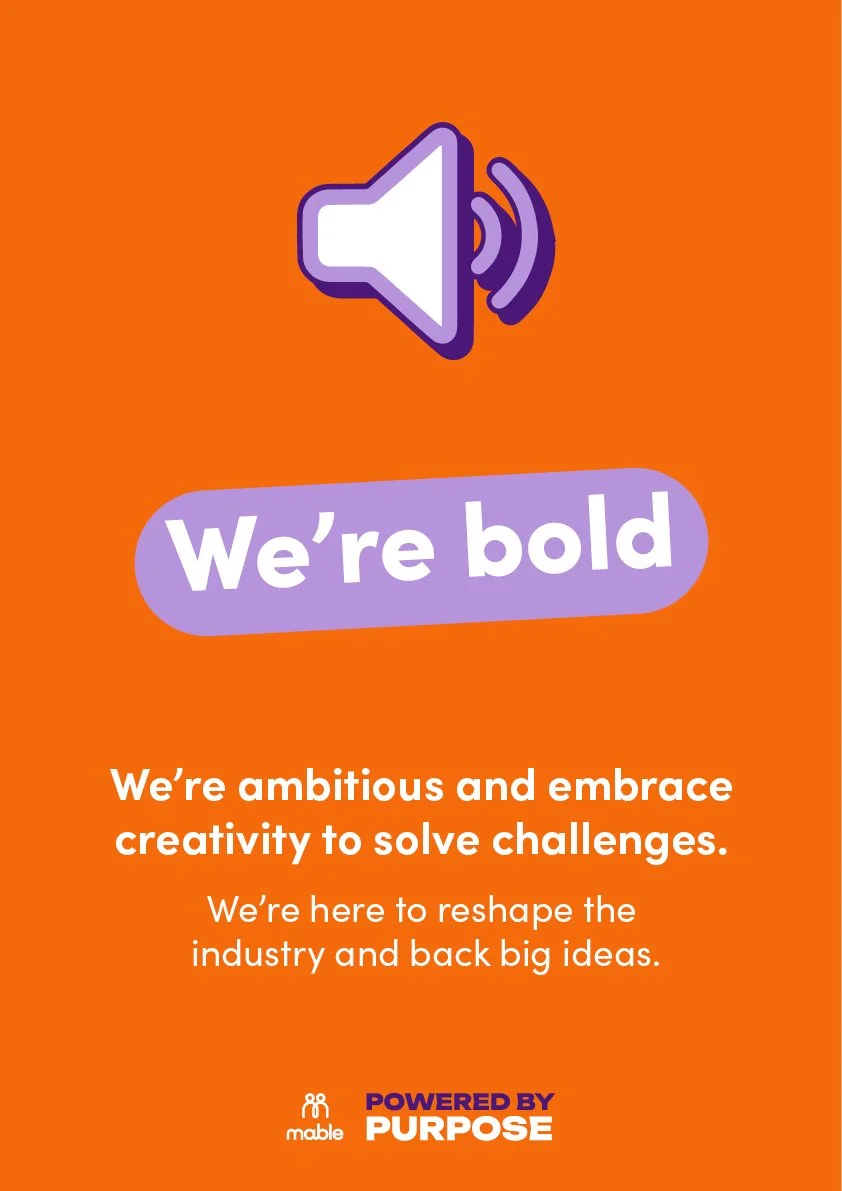
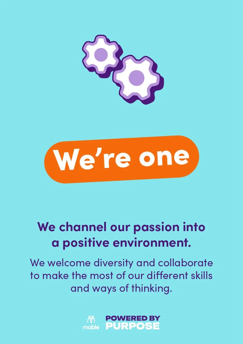
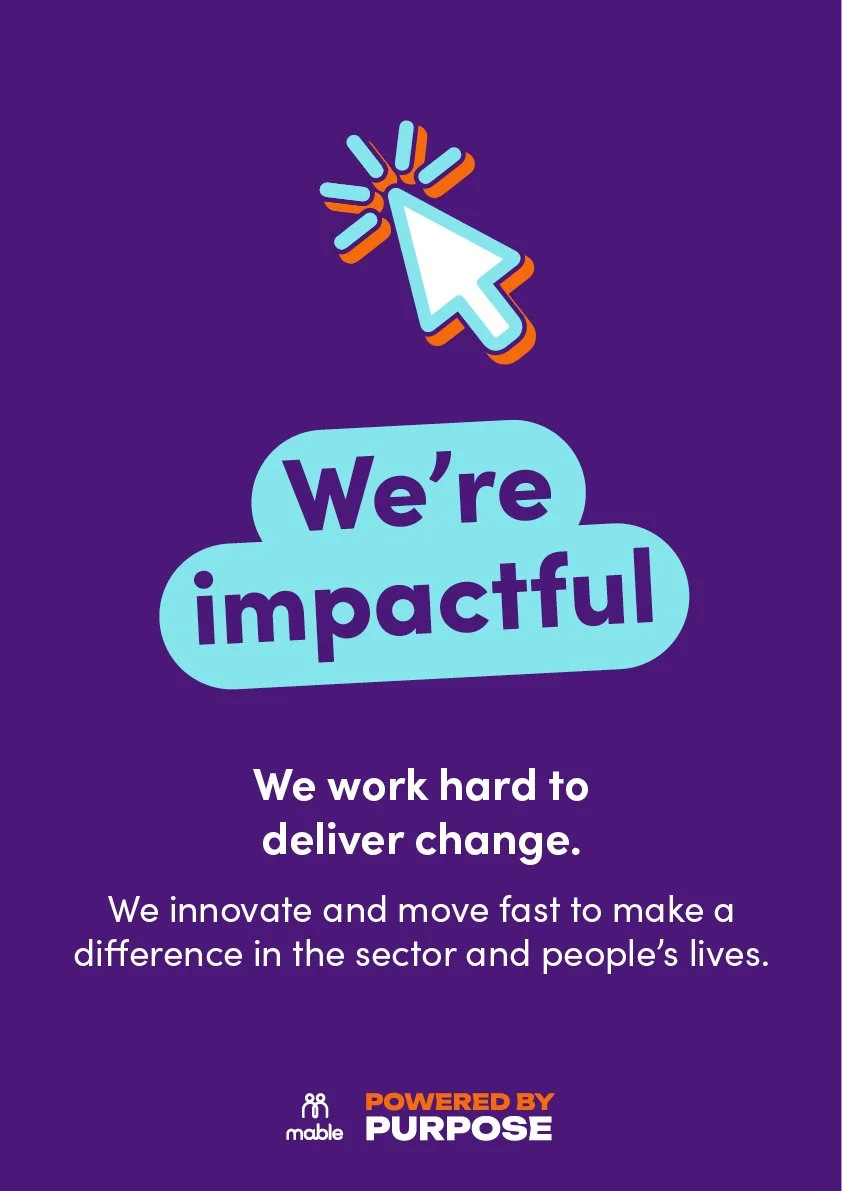
The identity had to flex from a Slack emoji to an onboarding poster to a launch-day banner. So it's a kit: a high-contrast palette pulled from Mable's existing purple and orange, a sticker-style icon set for everyday internal use, and one poster template applied consistently across values, people, and culture content.